Convert psd to css online!

Posted: 07/05/2009 in photoshop, Web
Tags: ,

If you’re interested in converting your psd files in your computer to css design automatically, you should try PSD2CSSONLINE. It’s very useful!

psd2css online - Converts your psd to css online!

psd2css online - Converts your psd to css online!

psd2css Online is Software as a Service that converts your fantastic, creative, artistic, no holds barred web page designs into dynamic XHTML and CSS web pages automatically. Use Photoshop or The Gimp to express yourself and create the most professional, aesthetically perfect, dynamic and functional designs you can think of. CSS stands for Cascading Style Sheets and is technically the best way to build your web pages.

Upload your Photoshop design, download your HTML file and images. It’s that simple.”

We love creating modern and clean web designs in Photoshop. If you’re an amateur, I think this article in Spoongraphics is so good for you.
“Build a complete website design mockup for a fictional design studio, starting with the creation of the initial layout then moving on to designing the individual page elements. The result is a modern, crisp and clean webpage layout ready for coding.”

Photoshop Website Design

Taking inspiration from various modern website designs, we’ll produce this clean and crisp website layout. Key features include horizontal bands to separate the content into specific areas; a colourful header area introducing the site; a friendly welcome message with examples of work; two-column main layout and a resource filled footer.

Wireframe

A good start with any design is to sketch out the plans on paper, the free reign of the pencil helps flesh out the rough layout with ease.

Wireframe

Planning out a wireframe also helps develop a hierarchy and gives an insight into the best positions for key elements of the design.

Create a new document in Adobe Photoshop, I tend to make the size of the artwork similar to that of a common widescreen monitor to give a good representation of the overall look of the site.

Place guides at a 960px width in the centre of the document and create a basic grid to place the page items against.

Begin with the creation of the header bar. Draw a selection across the full width of the document and fill with white. Double click the layer to open the layer styles and add a Gradient Overlay from grey to white running vertically.

Next, draw the main header area where the featured content will be placed. On a new layer draw a selection, then add a gradient overlay with a selection of two vibrant colours. Also add a subtle inner shadow to add depth to the design.

Subtle touches of texture can really bring a design to life. With the header area selected with a mask press CMD+SHIFT+C to Copy Merged, then paste on a new layer. Go to Filter > Noise > Add Noise to produce a simple texture, then set the blending mode to Multiply and reduce the opacity to suit.

Paste in the company logo, position on screen according to the grid, then add some styling through the layer style options. Add a gradient overlay to match the feature header colours, then create a very soft inner shadow.

Use the Type tool to create the text of the main navigation, set the type in a mid-grey while using a slightly darker version for the active link.

The feature header is a great place to introduce the website, with the vibrant background colour it is given main focus to the user. Use this space to place a snappy intro title in a custom font that matches the company branding.

Continue fleshing out the introductory content, but this time use Arial or Helvetica as the font so that the text can be set in plain old html, without any image replacement techniques.

Position a laptop into the featured area (a range of examples can be found here), this fits in well with the nature of the fictional company, and makes a great focal area to display examples of work on the laptop screen.

Emphasise this focal point with a radial gradient emitting from behind the laptop. This adds that little extra detail that lifts the element from the page.

Underneath the main header, draw another selection and fill with a grey-white gradient.

Split the mid section of the page into two columns with guides in relation to the grid lines. On the left we’ll have a main content panel, whereas the right will hold a thinner sidebar. Use the Type tool to add some dummy content. Alter the sizing and leading to give digestible and easily readable passages of text.

Below this main content area could hold an area to display the latest blog posts. Split the column into another two columns and draw up a selection of example post entries. The title links should stand out to the user as something clickable, so change their colour to give a visual clue.

Use the Rounded Rectangle tool to draw a box in the sidebar. The original colour doesn’t matter too much as we’ll be styling it up in the next stage.

Double click the layer and add a range of layer styles, including a grey-white gradient, a thin grey stroke and a soft inner shadow.

Use this sidebar panel to develop a Featured Project section. Elements could include a small screenshot and passage of text.

Draw another rounded rectangle to use as a button, add a couple of layer styles such as a gradient overlay and stroke to style the button to match the overall clean/grey theme.

Create a short, descriptive label for the button prompting the user to continue through the site to view further projects.

Signify the end of the content by drawing a footer area onto the screen. Fill the area with a light grey to differentiate it from the main content area.

Draw a circular mask and fill it with a black to transparent radial gradient. Press CMD+T to transform the selection, squash and stretch the gradient to form a long thin shadow-like graphic.

Position the shadow centrally on the screen, then delete the excess area above the footer. The result is a subtle shadow that lifts the main page, adding a little touch of detail to the design.

The footer area is a great place to hold secondary page elements, one example could be a client login area. Flesh out the design with the Type tool, then draw a couple of input boxes. Style the boxes with a soft inner shadow.

Use the central area of the footer to display a message about the company. Set the text using consistent header and body text font sizes.

Finally, add a point of contact in the lower right. These details will then be handy to the user throughout the site. Give prominence to the most important aspects through size and stronger weights or colour.

Photoshop Website Design

The final design fits all the desired elements neatly onto the page, while keeping everything aligned to the base grid. The result is a structured and clean layout with lots of subtle greys to add depth. Colour is then used to highlight feature areas and important content. Written by Chris Spooner

Simplistica Icons

Posted: 05/05/2009 in Icons
Tags: ,

I want to share one of the cleanest icon sets of the world! The free icon set of Dryicon‘s is very nice and has a glossy style. It consists of the most useful application and web icons. Icons come in these sizes: 16x16px, 32x32px, 48x48px and 128x128px and 32-bit transparency PNG file format. Enjoy your icons!

Simpliscita Icons Set

YOU CAN DOWNLOAD HERE

There are so many popular web sites which help you to convert Photoshop files (*.PSD) into HTML/CSS. Here I’ve listed 11 Best Tutorials/Sites to convert PSD to HTML/CSS. I hope you like them!

1 – The Design Lab: PSD Conversion

2 – From PSD to HTML, Building a Set of Website Designs

3 – Coding: Design Lab

4 – PSD to CSS/HTML in Easy Steps

5 – Slice and Dice that PSD

6 – Converting a Photoshop Mockup

7 – Build a Sleek Portfolio Site from Scratch

8 – Portfolio Layout – Learn To Code It

9 – Converting a Design From PSD to HTML

10 – How to Convert a PSD to XHTML

11 – How to Convert Psd to Html

See you soon!

If you’re a professional graphic designer, you’ve already know the importance of gradients in Photoshop. The gradients help designers to create better icons, backgrounds, buttons and finally web designs. So I want to share some good and web 2.0 gradients.

HOW TO INSTALL THESE GRADIENTS in PHOTOSHOP?

FIRST STEP: Download and put your gradients file (.grd) in the ‘Presets’ directory of your Photoshop program folder, under the subdirectory ‘Gradients’.

SECOND STEP: If the gradients you just saved do not show automatically in the gradient set menu, go to the gradient editor by clicking on the preset picker. Once the editor opens, select “load…” and locate the directory/folder where you save your new gradients. That’s all.

1 – WEB 2.0 STYLE GRADIENTS
Author: crazykira-resources
Terms of Use: Some rights reserved. This work is licensed under a Creative Commons Attribution-No Derivative Works 3.0 License.

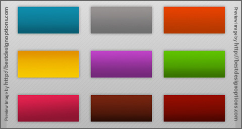
Crazykira Web 2.0 Photoshop Gradients

DOWNLOAD GRADIENTS

2 – GLOSSY WEB 2.0 GRADIENTS
Author: Yoshi 9
Terms of Use: Some rights reserved. This work is licensed under a Creative Commons Attribution-No Derivative Works 3.0 License.

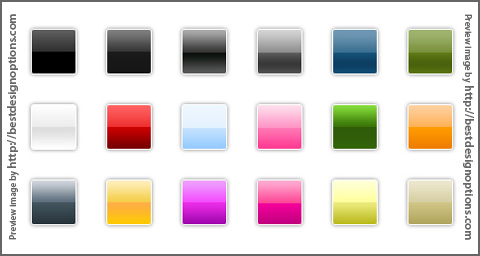
Yoshi Web 2.0 Photoshop Gradients

DOWNLOAD GRADIENTS

3 – Web 2.0 Photoshop Gradients
Author: verbaska
Number of gradients: 55
Terms of Use: Free for both personal and commercial uses

Verbaska Web 2.0 Photoshop Gradients

Verbaska Web 2.0 Photoshop Gradients

DOWNLOAD GRADIENTS

Free Illustrator Brushes

Posted: 30/04/2009 in Illustrator
Tags: ,

If you like using brushes in Illustrator, these creative brushes are so good sources for you.Our first brush comes from Vectortuts: Exclusive water color illustrator brushes!

watercolor

You can download it here

And the other creative brush set comes from Colorburned.com This free and selective set includes 33 Illustrator paint brushes.

bruhes.jpg

You can download it here

I hope you like them! (I liked so much…)

I was searching for some good icon sets for my last web project and I found dryicons.com. I picked one of their icon sets and want to share with you. Thanks dryicons!

“This set contains 160 high quality web icons in 32-bit transparency in PNG, ICO and ICNS. They come in 16 x 16px; 24 x 24px; 32 x 32px; 48 x 48px and 128 x 128px size.”

You can download the icon set here

In this article tripwire magazine (tripwiremagazine.com) presents an overview of more than 75 excellent free fonts you should consider using for your designs. Not all free Fonts are worth using but the Fonts listed in this article have all been picked out because they are better than the rest.

Introduction

The importance of typography in design can’t be underestimated. The right choice of fonts can really help to deliver the message in a more direct and suitable way. In this article some of the very best Free Font available are just a click away!

Just be sure to carefully review the terms and conditions included with each font whenever acquiring them from such sites, because the included legal docs are often eye openers for anyone intending to use them for client deliverable. And using fonts with no included terms and conditions is really setting yourself up for legal issues, as they were most likely stripped away at some point.

Make sure you maintain records of where fonts were acquired and keep the original archive file with the legal terms to prove permission of use.

The Fonts

Lacuna

To download the font enter the Flash page, click on “Glashaus Fonts” in the navigation menu at the top, in the opened page click on [MAC] or [PC] in the left menu to download the font.

Lacuna

Union

union

Echolot

To download the font enter the Flash page, click on “Glashaus Fonts” in the navigation menu at the top, in the opened page click on [MAC] or [PC] in the left menu to download the font.

Echolot

PetitLatin

petitlatin

Advent Pro

A fresh, modern typeface coming in 7 weights — bold, bold extra, regular rounded, regular, regular oblique, light and light extra. Commercial work containing this typeface must include the reference to the author; personal projects don’t neccessary need to have a reference. The advanced version of the font can be purchased.

advent-pro

Ambrosia
This font is free to use for personal purposes only. This version doesn’t contain kerning, accented character and foreign currency symbols.

Ambrosia

Medium Condensed

Medium-Condensed

Telegrafico

Licensed under a Creative Commons Attribution-Noncommercial-Share Alike 3.0 License. TrueType (.ttf).

telegrafico

Synapse

Synapse

176MKSD

176MKSD

Fonce Sans Regular

A sans-serif typeface that includes old style (hanging) numbers, a number of english and non-english lettering, some additional symbols and complete punctuation. This typeface is considered a Trial Version, in which certain letterforms have been replaced. Available only for non-commercial use as .otf. The advanced version of the font can be purchased.Fonce-Sans-Regular

SlabTallx

slabtallx

Pigiarniq Inuktitut font

Have you ever known about the existence of Nunavut? A small region in Canada with one of the lowest population rate of the world? Probably not. Only 0,01 people live there per km2, mostly Eskimo. The citizens of Nunabut speak four languages — French, English, Innuinaqtun and Inuktitut. Nothing spectacular so far, right?

Few years ago the government of the region has decided to design a new typeface to enable its 28.000 citizens to use all four languages in a uniform manner. The result is a beautiful, rich and professional sans-serif free font. The family includes a bold, heavy, italic, light and regular weights. Examples.

Pigiarniq

MUSEO

MUSEO

Delicious

Delicious

Twenty one

twenty-one

Museo Sans

Museo Sans is based on the well-known Museo. It is a sturdy, low contrast, geometric, highly legible sans serif typeface very well suited for any display and text use.

Museo-Sans

Tallys

Tallys is a font that is one degree slanted and has large caps, a small x-height and long ascenders. It comes (see also Fontin) with hybrid numbers and a complete character set.

Tallys

Anivers

The name Anivers derives from the word anniversary and was originally designed to celebrate the anniversary of Smashing Magazine. See some examples here.

Anivers

Kontrapunkt

On October 22 2004 Kontrapunkt was awarded the Danish Design Prize for best typeface. The awarded typeface is our own corporate typeface ‘Kontrapunkt Light’, used in headers on this website and our printed material. The award was handed over by Crown Prince Frederik to creative director Bo Linnemann at a ceremony in Danish Design Centre.

kontrapunkt

Aardvark Cafe Font

Aardvark-Cafe-Font

Reminga

Reminga OT Bold Italic

FF MT

Employing obscure but powerful techniques like vwl mmssn and cap reduction, FF Mt uses up to 50% less paper, screen, and wall space than other text faces without a single condensed letter.

FF MT

Diavlo

Diavlo is a free font that contains 5 weights: Light, Book, Medium, Bold and Black.

Diavlo

Fertigo

Fertigo

Fontin Sans

With a nice classical appearance it will be a perfect match.

fontin-sans

Mido

Mido

Kapitza Pop (decorative)

A free version of Pop contains 8 graphic elements in 4 weights (Pop10, Pop20, Pop30, Pop40). When repeated, each Pop element creates a unique pattern which can be combined into an infinite variety of patterns. This font is not free to
use commercially, please read the Licence Agreement.

Kapitza-Pop

Goudy Bookletter 1911

Goudy-Bookletter-1911

Faustant

faustant

Comfortaa

comfortaa

Fontin

The Fontin is designed to be used at small sizes. The color is darkish, the spacing loose and the x-height tall.

fontin

bankrutt

bankrutt

Heretica

heretica

Steiner

This typeface is ideal for logos and general design. It isn’t very suitable to be used with word-processors as it lacks some symbols and letters. Sans Serif, free for personal use only.

steiner

Mg Open Moderna

MgOpenModerna

Patronne

patronne

Geo Sans Light

Geo+Sans

AUdimat (v2)

OpenType, Mac, PC, in four weights: regular, italic, bold, bold italic.

audimat

alusine

alusine

consume more

consume-more

Megalopolis extra

megalopolis-extra

stigmate

stigmate

Liberation Sans

Public domain / GNU GPL, Regular, Italic, Bold, Bold Italic, PC / Mac OS X

liberation-sanf

Liberation Serif

Public domain / GNU GPL, Regular, Italic, Bold, Bold Italic, PC / Mac OS X

liberation-serif

Enfer

enfer

JustOldFashion

justold

Lido STF

The typeface is suitable for all periodicals wishing to abandon inconspicuously the hideous system typefaces with their even more hideous accents and to change over to the contemporary level of graphic design. It is also most convenient for everyday work in text editors and office applications. It has a fairly large x-height of lower case letters, shortened serifs and simplified endings of rounded strokes. Lido STF examples. For professional use you need a valid license which means purchasing the font.

lido

Watch tv

watch-tv

Mg Open Canonica

MgOpenCanonica

Yanone Kaffeesatz

This “coffee”-font is supposed to be used in headlines and brief text passages; it shouldn’t, however, be used for body copy. The numbers and currency signs are monospaced, which means that they have the same width. The alternative and historic symbols as well as ligatures can be activated via the OpenType-option »optional ligatures«. Released under Creative Commons license. Examples.

yanone-kaffeesatz

Mg Open Cosmetica

MgOpenCosmetica

Audimat mono

audimat-mono

Geronto bis

geronto-bis

Cicle

Sans-Serif, 7 weights, freeware.

cicle

Cardo

Cardo is a large Unicode font specifically designed for the needs of classicists, Biblical scholars, medievalists, and linguists. This font is free for personal, non-commercial, or non-profit use. Examples.

cardo

Mg Open Modata

MgOpenModerna

Telerysm mono 2

telerysm-mono-2

OHmygod

ohmygod

Day Roman

In digitizing this typeface, attention was mainly given to duplicate the technical imperfections of 16th century printing, which have been lost with today’s technologies. In order to accomplish this, some digital type design conventions have been avoided – things like the uniformity of the serifs, overall stroke precision, vertical proportion exactitude. This digitization should work nicely when used anywhere from 10 to 30 pt. Some design oddities, appealing or otherwise, may appear in 30+ pt usage. This serif-font is available in PC Type 1 and PC True Type formats. Examples.

day-roman

Gentium

Gentium is a typeface family designed to enable the diverse ethnic groups around the world who use the Latin script to produce readable, high-quality publications. It supports a wide range of Latin-based alphabets and includes glyphs that correspond to all the Latin ranges of Unicode. Gentium examples.

Gentium

District Thin

A very calm, serious and impressive sans-serif free font from GarageFonts’ District family. The font is available as Mac Postscript, Mac TrueType, PC Postscript, PC Truetype and OpenType.

District-Thin

Romeral

Romeral offers aside from optimal legibility an elegant style, rounded forms and sharp geometric structure of its letters. Romeral is designed to produce a noticeable visual impact that invites the audience to the reading due to its sizable thickness. Interestingly enough, the basic idea of this OpenType-font was to find a way to fill the color titles zone in order to create a comfortable atmosphere for the reading experience. It can be used for body copy and headlines. Free to use in personal and commercial projects.

Romeral

Chúcara

To get the font, contact the designer Juan Pablo De Gregorio or add a comment to the post, explaining, who you are, why are you willing to get the font and how do you intend to use it. The author sends the font via e-mail.

chcara-una-tipografa

Redevance

redevance

Scriptina

Handwriting, PC, Mac.

scriptina

Engel Light Ltd

Sans-Serif, PC, Mac, no special characters available.

Engel

Mank Sans

Mank-Sans

justice

justice

Greyscale Basic

Greyscale Basic

Trottoir

Based on the most trampled typeface in the world: the Pont-à-Mousson’s sewer covers font.

trottoir

Qlassik

Qlassik

Existence Light

A free sans-serif font designed by Yeah Noah. 3 weights — Light, UnicaseLight, StencilLight. OpenType, PC, Mac OS X.

Existence-Light

Venturis ADF

20 weights.

venturisadf

COM4t Fine Regular

COM4t-fine-reg